
Have you ever thought about the colours you use in your business and the effect they have?
As humans we’re in tune with our subconscious brain, and colour can have a greater emotional effect than we realise. Colour can affect our reactions and behaviour, which means it can impact your customers and your marketing too.
Maybe when you were designing or choosing your logo you chose the colour scheme you liked. But why were you drawn to those colours? What do they say to you, and do they evoke the feelings you want to be associated with your company?
The chances are much of this happened subconsciously, but there are compelling reasons to tune into colour:
• 92.6% of people believe that colour and design is the #1 influencing factor when deciding on a purchase
• Within the first 90 seconds of encountering a new product or brand, we make a subconscious judgement it, and a huge 90% of that judgement is made based on colour.
• 80% of brand recognition is based on colour
Some quick colour theory
I studied floristry back in the early 00’s because I wanted to buy a floristry business, and I’ve always loved flowers and plants. Studying colour, and the effects of colour, was a chunky part of the course because flowers are often sent to convey a message we can’t say in words. The same principles apply in a marketing context too.
Before looking deeper into the use of colour to evoke emotions and behaviour, it’s worth a quick reminder of colour theory and the colour wheel.
Primary colours: Red, yellow, and blue (can’t be formed by combining other colours)
Secondary colours: Green, orange, and purple (hues created by mixing primaries)
Tertiary colours: Mix of primary and secondary colours
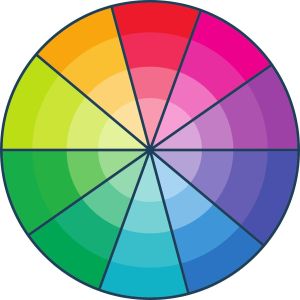
The colour wheel is made up of hues, tints (hue plus white), shades (hue plus black) and tones (hue plus black and white). By using a colour wheel, we can identify which colours looks best together, depending on the effect we want to achieve. If you want to create a simplistic scheme for example, you might opt for a monochromatic colour scheme, where all the tints/shades/tones from just one hue are used.
The seven major colour schemes are monochromatic, analogous, complementary, split complementary, triadic, square, and rectangle (or tetradic). An analogous colour scheme for example, uses a hue and the two colours on either side. This creates a soft effect because the colours blend gradually, whereas a complimentary colour scheme uses colours which are directly opposite each other on the colour wheel, so the contrast between the colours is greater and more impactful.
Your designer will know all of this obviously, but if you don’t have one and you’re creating your own graphics, it’s worth researching this further. It can make such an impact on your marketing if you understand how to harness the power of colour.
How do we react emotionally to colour?
Colour can play an important role in conveying information, creating certain moods, and even influencing the decisions people make. Colour preferences also exert an influence on what we buy, the clothes we wear, and how we decorate our homes.
People often select objects in colours that evoke certain moods or feelings, such as selecting a car colour that seems sporty, classy, sleek, or trustworthy. We might paint a bedroom in a soft green or pastel blue to create a peaceful place to relax and sleep.
How you feel about colour is partly rooted in your own experience and culture too. White might symbolise purity and innocence in Western society, while some Eastern countries use white as the colour of mourning.
Few colours have been so closely associated with an emotion as blue. Pablo Picasso was famous for adopting certain pigments during periods of his career. “Colours, like features, follow the changes of the emotions'” he reflected in the 1930s. Blue was the first colour to wholly dominate the artist’s work and he took to the colour when he was a struggling and melancholy young artist.
Was he ‘feeling blue’?
This phrase relates to the old shipping tradition of flying a blue flag when the captain of a ship died, but people still use the phrase today. In this instance, the blue is linked to the tears of sadness.
And what about red mist or seeing red? Here, red is associated with anger, perhaps even extreme anger which can temporarily cloud judgement.
There are dozens of examples, but the point is – we all relate to colour.
The main colours and how they’re used.
Red
Red is the hottest and most dynamic colour. It’s activating, passionate and powerful so it’s no surprise that red roses are the most popular choice on valentine’s day. It symbolises danger and anger too, so red should always be used carefully. Major brands including Coca Cola, Netflix and YouTube all use red to create feelings of excitement and to stimulate action.
Orange
Orange isn’t as full-on as red. It’s more friendly and inviting but still has an energetic feel. Fanta, Harley Davidson and Nickelodeon have a vibrant energy that’s approachable and confident.
Yellow
Nikon, McDonalds and Mailchimp all use yellow, a bright and joyful colour which is warm and stimulating. Interestingly, McDonalds combines red and yellow to produce a double whammy of stimulation and action. I’m vegetarian so I don’t experience the McDonalds effect, but when my other half sees the golden arches, he instantly wants McDonalds, and immediate gratification. He might argue that’s because he loves a burger, but would McDonalds be so instantly impactful if the branding was in muted blue or green?
Green
Green is calming, balancing, and rejuvenating. It’s an earthy, fresh colour which suggests healing and a sense of stability. Landrover, Starbucks and Carlsberg all use green in their branding.
Blue
Blue is a popular colour for logos, creating a sense of calm dependability. It’s the colour of security, trustworthiness, and integrity – all important values for any business, especially those associated with money or personal information. Social media giants Twitter, Facebook and LinkedIn all have blue logos as do Ford, PayPal and American Express.
Purple
The colour purple has become synonymous with Cadbury. When John Cadbury founded his company in 1824, he believed that chocolate could be a force for good in the world, and the colour choice is said to be a tribute to Queen Victoria. Purple stands for royalty, nobility and dignity and is often linked to creativity and imagination too.
Black
Although not technically a ‘colour’, black is often used to communicate a sense of class and elegance. It’s a dramatic colour which also suggests a sense of protection and security. It’s serious, and authoritative, but also mysterious and ominous. Chanel, Nike and North Face have black logos and it’s a popular colour choice with high-end products or services.
White
White suggests purity, cleanliness and simplicity, and is often used with another colour. Black and white logos are often used interchangeably – Nike, Channel and North Face all reverse out their logos. Uber uses simple white text on a black background as does the BBC. Black and white in combination is cold to some, but the simplicity and understated elegance still makes the combination a popular choice.
The use of colour then, is key in your branding (stationery, brochures, premises) but also in your marketing activity.
So, how do you choose the right colour for your website or social media posts?
If you’re using social media in your marketing the primary objective is to stop people scrolling.
If you think about the miles of scrolling your audience does daily, you have a split second to stop them going past your post.
These three simple examples show how colour not only changes the feel of the graphic, but also how colour choice can affect the impact in a social feed. The first example in black feels classy, high end and even a little mysterious. The middle version immediately says ‘sale’ and visually stands out much more than the other two. The green version on the right feels like it could be for an eco-product. It’s more subtle and calming.
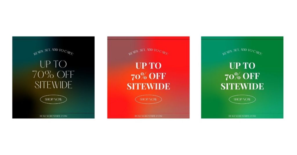
Which one would appeal to your audience?
Would they stop at the bright red graphic, or would they immediately judge it as a cheaper offering and scroll on? It might grab their attention, but will they read or click?
There’s some evidence which shows that red, purple and pink promote sharing, while green, black, blue and yellow all stop people from sharing.
Using a call-to-action button? According to Yahoo, red, green or orange/yellow is the way to go, dependent on the background colour. The button should stand out so it’s clear what you want people to do. On a side note, don’t try anything fancy with your buttons. As humans, we like familiarity and we’re wired to look for systems and processes we’ve encountered before. Funky shapes or memes have their place, but not as a button.
And have you noticed how hyperlinks are usually blue? It’s recognised as the main colour for links, so if we see blue text, we know it’s a link.
Understand your customers and test to see what resonates with your audience. But remember – it’s about them, not you. You might not like muted vintage tones personally, but if it fits with your product or service, and appeals to your audience, it’s time to put personal tastes aside.
So, the example used above might work better like this, depending on your branding and audience.

• Less is more – keep it clean and simple
• Use white space for clarity
• Use conventional formatting and colours for buttons and links
• Blue border – for authority, dependability, and trust
• Red call-to-action button for immediacy and excitement
• Simple black text which is easy to read against the white (white text against coloured backgrounds can be hard on the eye).
Conclusion
Some psychologists are sceptical about the subliminal effects of colour, and research in this area is sketchy. How have these colour associations developed and are they really as powerful as some make out? Certainly cultural, personal and situational factors have an influence, but without doubt there is an effect.
As a marketer, colour is part of the communication process, so it shouldn’t be ignored. Test, and track results to see what resonates most with your audience. It’s all part of honing your marketing and making it work as hard as it can for you.
If you’d like to talk about your marketing, please get in touch.
